
The Layout settings let you personalize how your Rocket.Chat workspace looks and behaves. You can edit home page content, customize the login page, run custom JavaScript for specific user events, apply custom CSS, and configure user interface options.
Access the Layout settings
You can reach the Layout settings in two ways:
From the admin menu, go to Manage → Workspace → Settings → Layout.
From the workspace home screen, click Customize in the top right. This opens the Layout settings directly.
The settings are organized into six collapsible sections: Custom Scripts, Home page content, Login, Room Header, Custom CSS, and User Interface. Each section is described below in the order it appears in the UI.
Each script and CSS field includes a Full Screen button for easier editing of longer code.
Custom Scripts
The Custom Scripts section lets you execute JavaScript in response to specific events in the workspace. The following settings are available:
Field | Description |
|---|---|
Custom Script for Logout Flow | Define a script that runs during the logout flow for all users. |
Custom Script for Logged Out Users | Define a script that runs for any user who is not logged in, such as visitors on the login page. |
Custom Script for Logged In Users | Define a script that runs for any logged-in user, for example, every time they enter the chat. |
For example, the following script triggers a Welcome alert when a logged-in user lands on the /home page:
if(window.location.pathname == '/home'){
    alert("Welcome")
}
The following screenshot shows the result of the script:
.png)
Home page content
This section lets you change the content of your workspace home page.
Field | Description |
|---|---|
Home Title | Enter the title displayed at the top of the workspace home screen. |
Show home page button on sidebar header | Enable this setting to display the Home button on your workspace's navigation menu.
|
Content block | Enter the custom content displayed on the home page. The content may be placed inside a white block or, on a Premium plan, take up all the available space on the home page. |
Show custom content to homepage | Enable this setting to display the custom content from the Content block field on the home page. |
Show custom content only | Enable this setting to hide all other content blocks on the home page. This can be enabled only when Show custom content to homepage is also enabled. |
Terms of Service | Enter the terms of service for your workspace. Also accessible at |
Login Terms | Enter the terms users must accept before they log in. The login terms are displayed on the login page. |
Privacy Policy | Enter your server's privacy policy. Also accessible at |
Legal Notice | Enter the legal notice for your server. Also accessible at |
Side Navigation Footer - Dark Theme | Provide the logo or text shown at the bottom left of the sidebar in dark mode. The footer size is 260 x 70px. For better consistency, we recommend using images uploaded in your Assets.
|
Side Navigation Footer | Provide the logo or text shown at the bottom left of the sidebar in light mode. Same dimensions and recommendations as Side Navigation Footer - Dark Theme. |
.png)
.svg)
.png)
Login
Customize your workspace's login page.
Field | Description |
|---|---|
Hide Logo | Enable this setting to hide the Rocket.Chat logo on the login page. |
Hide Title | Enable this setting to hide the title on the login page. |
Hide "Powered by" | Enable this setting to hide the Powered by watermark on the login page. |
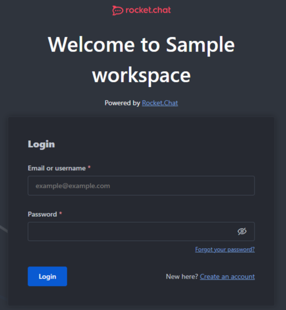
Login Template | Select the orientation of the login page layout. The options are
The following screenshot shows the Vertical template:
For screen sizes less than 1440px, the display remains in the vertical format. |
Show Default Login Form | Enable this setting to display the default login form. If disabled, the login fields are not displayed. You can disable this setting if you want to use an identity provider. |
.png)
Important:
If you disable the Show Default Login Form option, the login fields are not displayed and you cannot log in with your username/email and password. To re-enable the login form, follow one of these methods.
Method 1: Environment variable
Update your environment variable file by adding
OVERWRITE_SETTING_Accounts_ShowFormLogin=true. For details, see Manage Settings Using Environmental Variables.Method 2: MongoDB shell
Connect to your Mongo shell and switch to the Rocket.Chat database:
use rocketchatCheck the current value of the setting:
db.rocketchat_settings.findOne({"_id": "Accounts_ShowFormLogin"})To disable the form, run:
db.rocketchat_settings.updateOne({"_id": "Accounts_ShowFormLogin"}, {$set: {'value': false}})To enable the form again, run:
db.rocketchat_settings.updateOne({"_id": "Accounts_ShowFormLogin"}, {$set: {'value': true}})
Room Header
Control which actions appear in the room header toolbox, their order, and how many stay visible before the rest collapse into the kebab menu (⋮).
This section appears only when Allow Feature Preview is enabled for the workspace.
Field | Description |
|---|---|
Room Toolbox Layout | A JSON array that defines the header toolbox layout for public channels, private channels, and direct messages. It takes effect only for users who have enabled the Room Toolbox Layout feature preview. Refer to Customize the Room Header Toolbox for the JSON schema, field reference, and validation rules. |
Custom CSS
In the Custom CSS section, you can define custom CSS to modify your workspace's appearance. Refer to the Customizing Colors guide to learn about the available classes and colors. For a cohesive user experience, we recommend using the variables outlined in the guide. After saving the CSS changes, refresh the page to view the changes to the workspace.
For example, the following CSS snippet changes the color of buttons and secondary elements in rooms and settings:
* {
--rcx-color-button-background-primary-default: #004744;
--rcx-color-button-background-primary-hover: #008079;
--rcx-color-button-background-primary-press: #00756F;
--rcx-color-button-background-primary-focus: #00A59D;
--rcx-color-button-background-primary-keyfocus: #004744;
--rcx-color-button-background-primary-disabled: #B8FFFB;

--rcx-color-button-background-secondary-hover: #008079;
--rcx-color-button-background-secondary-press: #00756F;
--rcx-color-button-background-secondary-focus: #004744;
--rcx-color-button-background-secondary-keyfocus: #004744;
}
The following screenshot shows how a room looks with the CSS customization applied to primary and secondary elements, including hover and press states:
.png)
Important
Customizing the user interface (UI) colors can significantly impact contrast, potentially leading to your UI not meeting WCAG standards. Any color changes you make will apply to all color themes (light, dark, and custom themes).
While many UI elements can be customized, we strongly recommend focusing your color changes on buttons only, as this enhances brand alignment without disrupting the user experience. We recommend testing the options on a development workspace first.
User Interface
Define the user interface behavior for your workspace. These settings depend on your workspace's Accounts and General settings.
Field | Description |
|---|---|
Display Roles | Enable this setting to display user roles beside usernames in messages. |
Group channels by type | Enable this setting to group channels by category (Channel, Private Room, Direct Message, or Discussion) on the left sidebar. |
Use Full Name Initials to Generate Default Avatar | Enable this setting to generate default avatars from the user's full name instead of the username. Changes may take some time to reflect for existing users. For example, if the username is |
Use Real Name | Enable this setting to display full names in messages instead of usernames. |
Number of users' autocomplete suggestions | Enter the number of autocomplete suggestions shown when tagging a user with the For example, if you set the value to |
Unread Counter Style | Select how unread message counters are displayed. The options are:
|
Allow Special Characters in Room Names | Enable this setting to allow special characters such as |
Show top navbar in embedded layout | Enable this setting to display the top navigation bar in an embedded layout. |