Icons act as visual shorthand across the Rocket.Chat product and marketing materials. They follow the same principles as the rest of the brand and must look consistent.
Principles
Brand colors as the focal point. Icons use the official Rocket.Chat colors, with transparency for a lighter, more approachable feel.
Simple, clean lines. Avoid excessive detail. Icons must remain recognizable at small sizes.
To the point. Each icon conveys its meaning quickly and clearly, without ambiguity.
Consistent details. Every icon in the set uses the same stroke weight and corner radius.
Icon examples
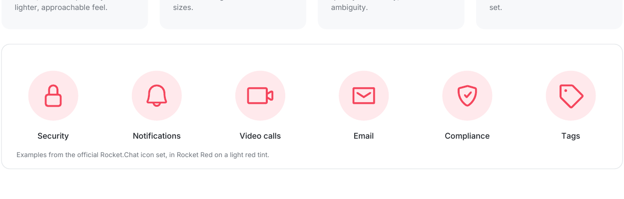
These examples from the official Rocket.Chat icon set show Rocket Red icons on a light red tint: Security, Notifications, Video calls, Email, Compliance and Tags.
Use the official Rocket.Chat icon set. Don't draw your own icons. Ask your Rocket.Chat contact for the approved icon files.